Let’s get to know each other
Accelerate your business potential with our dedicated team.

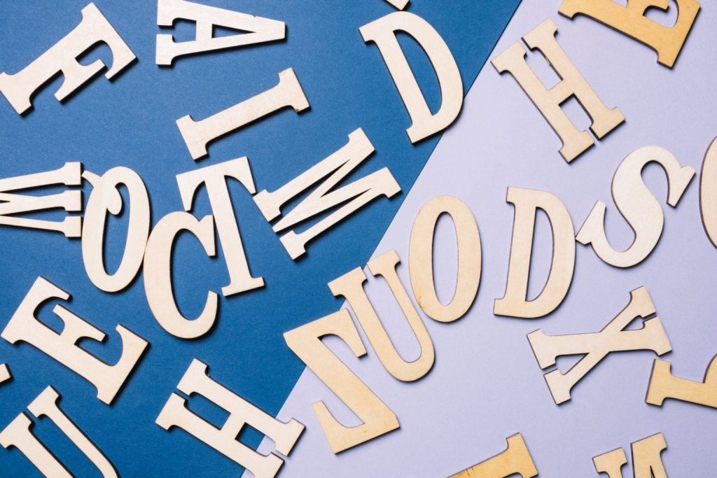
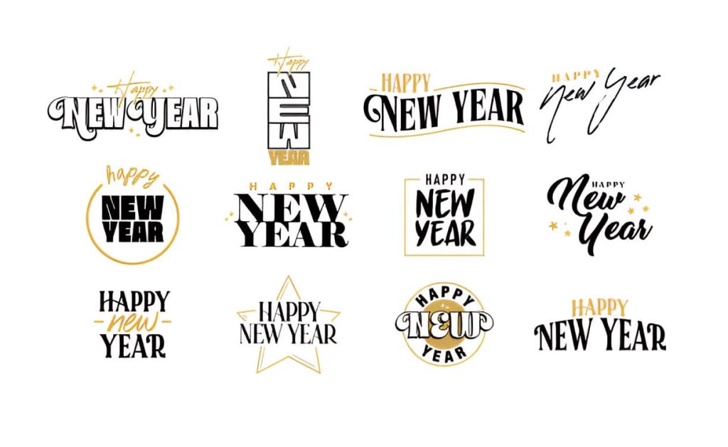
Best Fonts for Logo
Journey Through Design and Style
JANUARY 27, 2025 8 MINUTES 02 SECONDS
Branding
Content
Hey there, future logo legend! You’ve got the business, the vision, and maybe even a killer name. But now comes the tricky part: picking the best font for a logo. Sounds simple? Think again! Fonts are the unsung heroes of design—a bad choice can scream “amateur hour” louder than a karaoke singer on a Friday night. Here is how to make your logo stand out with the best font:
Key Takeaways- The Role of Fonts in Branding: Fonts act as the “voice” of your brand, shaping perceptions and emotions before the audience even reads the text. They are crucial for setting the tone and conveying your brand’s identity.
- Font Categories and Their Impact: Understanding font types like serif, sans-serif, script, and display fonts helps align the logo with the brand’s message—whether it’s modern, elegant, playful, or bold.
- Strategic Font Selection: Key factors like audience alignment, scalability, legibility, and thoughtful pairing of fonts ensure the logo remains impactful across various mediums.
- Testing and Consistency Matter: Testing font choices across applications and maintaining consistency throughout branding materials are essential for fostering trust and recognition.
Why Font in Logo Design Matters?
Let’s understand why fonts are such a big deal. Think of your font as the voice of your brand. A bold, clean font can say, “We mean business,” while a playful script might whisper, “We’re creative and fun!” Fonts set the tone before your audience even reads the words. It’s like judging a book by its cover—except everyone does it.
Imagine the phrase “font logo design.” If you add a clean, modern sans-serif font, it’s all business. Now, switch to a whimsical handwritten font, and suddenly, it conveys a completely different message—maybe it’s a cozy cupcake shop or an artsy boutique.
Fonts for business logos need to hit the sweet spot between personality and professionalism. They communicate your brand’s values, mission, and aesthetic. This helps in forging an emotional connection with your audience. Good design is often about simplicity, but choosing the right font is as complex as it gets, with countless options vying for your attention.
LEARN MORE: HOW TO DESIGN A LOGO?
Font Types: A Quick Crash Course
Let’s break down the main categories of fonts. Each type carries its unique characteristics that evoke different feelings.
1. Serif Fonts
Some popular examples of Serif fonts are Times New Roman or Garamond. These fonts have little lines at the ends of letters. This gives off a classic and trustworthy vibe. These fonts evoke a sense of tradition and reliability, making them perfect for law firms, financial institutions, or upscale restaurants. With their rich history, serif fonts often exude authority and stability, making them the bread and butter of many established brands.
2. Sans-Serif Fonts
Sleek and modern, like Helvetica or Arial. No frills here, just clean lines and a minimalist aesthetic. It is ideal for tech startups and cutting-edge brands; sans-serif fonts convey modernity and simplicity. These fonts are highly legible across various mediums. Hence, they are a favourite choice for digital brands.
3. Script Fonts
Fancy and flowing, these mimic handwriting. Great for wedding planners, boutique brands, or any business that exudes elegance. But use these sparingly—too much, and you risk falling into Comic Sans territory, which nobody wants. Script fonts can add a personal touch or a whimsical image but require careful consideration to ensure they align with the brand’s overall message.
4. Display Fonts
The wild cards of the font world. These are quirky and unique, designed to grab attention. Use them when you want to make a statement or stand out from the crowd. Display fonts are excellent for brands with a fun personality or those in creative industries, such as art, fashion, or entertainment.
Choosing the right font type is like picking the perfect outfit for an occasion. You wouldn’t wear a tuxedo to a beach party, right? Likewise, your logo font must align with your brand’s identity and the message it wants to convey.

Factors for Choosing the Right Font

Now that you have a basic understanding of font types let’s understand how to pick the one that is perfect for your brand. Here are some essential tips:
1. Know Your Audience
This is paramount. Understanding who your audience is and what they value is essential. Consider the demographics, psychographics, and preferences of your target audience.
2. Think About Scalability
Your logo needs to look good on a variety of scales—from a tiny business card to a massive billboard. Choose fonts that are legible and recognisable in different sizes, ensuring they carry the same impact on every medium.
3. Pair It Right
Mixing fonts can enhance your design if done thoughtfully. Make sure the fonts are complementary. A serif font paired with a sans-serif is usually a classic safe bet. You can utilise a bold typeface for your business name and a lighter style for the tagline or descriptor.
4. Legibility is Key
The ultimate goal of any font is to be read effortlessly. If people can’t read it, what’s the point? Skip overly decorative fonts unless you’re okay with everyone squinting to decipher what’s written. Ensure that your selected font is not just pretty but highly legible at a glance.
Examples of Best Logo Fonts
Ever wonder what font makes Amazon’s smile so iconic? Or why Facebook’s logo is instantly recognisable? Let’s have a look at some of the heavyweights in the branding world.
- Amazon Logo Font: The Amazon logo uses a custom sans-serif font that’s clean, modern, and approachable. This clean font reflects its commitment to customer service and innovation. Moreover, the orange arrow under the name adds a subtle but effective visual element that points from A to Z, emphasising the brand’s wide range of products.
- Target Logo Font: This brand sticks with a bold, sans-serif font that is straight to the point—just as their brand messaging indicates simplicity and directness.
- Google Logo Font: It also opts for sans-serif, but it adds a playful touch with primary colours. This combination showcases Google’s focus on innovation and accessibility.
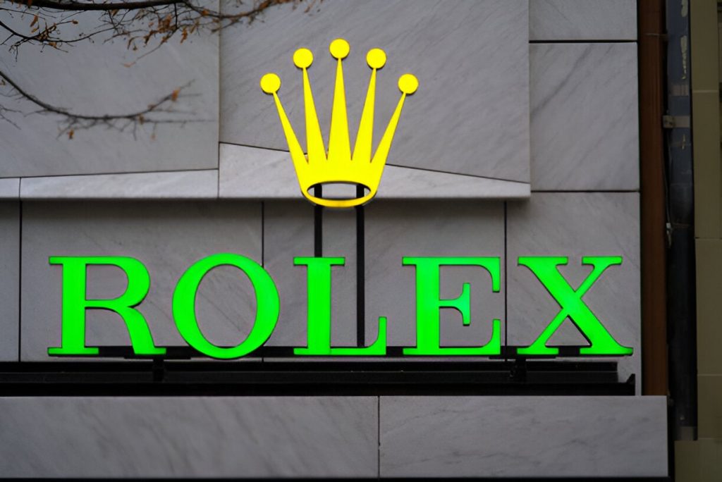
- Rolex Logo Font: The serif font used screams luxury and timelessness. It also conveys a sense of high-end craftsmanship akin to the tailored suit in the fashion world. The logo is a testament to the brand’s rich heritage and the precision of its watches.
Successful logos use fonts that align perfectly with their brand personality.
15 Best Fonts for Business Logo
Here are some of the best fonts to consider for a business logo:
- Helvetica: Helvetica is versatile and always in style. It communicates clarity and professionalism.
- Gatsby: Retro and classy, it’s great for vintage vibes, and it’s perfectly suited for brands aiming for an old-world charm.
- Futura: Bold and modern, perfect for forward-thinking brands looking to push boundaries and be seen as innovative.
- Baskerville: Classic and sophisticated, ideal for high-end businesses or any brand wanting to convey elegance.
- Montserrat: Sleek and geometric, it’s a favourite for startups aiming for a modern aesthetic in their branding.
- Lobster: Fun and friendly, this script font is perfect for creative brands that want a casual yet inviting presence.
- Raleway: Elegant yet modern; a great all-rounder that feels both established and approachable.
- Playfair Display: This one is both stylish and sophisticated. It is particularly well-suited for luxury brands wanting to convey opulence.
- Roboto: Clean and professional, it works wonders for tech companies that want to appear modern yet trustworthy.
- Poppins: This sans-serif beauty balances playfulness and polish, making it an excellent choice for trendy brands.
- Oswald: Strong and bold; it’s great for impactful logos needing to grab attention instantly.
- Avenir: Timeless and versatile, its modern design works for just about any brand, from tech to hospitality.
- Copperplate: Fancy and formal; ideal for upscale businesses seeking to project sophistication.
- Pacifico: Whimsical and handwritten, it’s charming for creative ventures that aspire for an approachable, friendly image.
- DIN: Clean, industrial, and highly legible, this font is suitable for brands emphasising straightforwardness and functionality.
How to Choose a Font for a Logo?
Now that you’ve seen the options let’s talk about the strategy. Fonts can’t just look pretty—they need to work hard for your brand. Here’s how to make them count:
- Test, Test, Test: Before committing, experiment with your chosen font in different sizes and settings. How does it look on your website? Your packaging? Your business cards? A test run can show you how the font works across various platforms and uses.
- Stay Consistent: Once you’ve picked a font, adhere to it. Brand consistency builds trust and recognition, ensuring that your audience identifies with your brand instantly. Maintaining a consistent font across all branding materials—from your logo, business cards, and website to social media platforms—escalates your brand’s visibility.
- Get Feedback: Sometimes, an outside perspective can save you from a design disaster. Ask friends, colleagues, or even potential customers what they think of your font choice. Feedback may provide valuable insights and help you refine.
- Don’t Skimp on Quality: Free fonts are surely tempting, but premium options often offer better design, versatility, and flexibility. Consider investing in quality fonts, as they can elevate the professionalism of your brand.
Choosing the right font is like selecting a best friend for your brand who will stand with you till the end. It needs to resonate with your brand, stand by you, and make you look good in any situation. Remember, the best logo fonts aren’t just about aesthetics; they’re about telling your brand’s unique story. Experiment, explore, and understand what your brand needs.

Frequently Asked Questions
-
What font does Amazon use?
Amazon uses the Amazon Ember font for its website and products.
- What font is the New York Times logo?
Let’s get to know each other
Accelerate your business potential with our dedicated team.