JULY 2020
How to Design a Perfect Logo in 2024?
In the wake of mass production during the late 19th Century, a British brewery planted the seed of modern logo designing. The Bass red triangle was a memorable milestone for modern logos – it set the ball rolling for a perpetual tryst between iconic brands and iconic logos. But it’s not that logos didn’t exist before Bass. Logos, or a very outdated version of them, can be traced back to the Medieval Ages. These logos existed in the form of family crests and hieroglyphs, and were mostly meant to show ownership. Today, we’ve moved way past all that. Logos hold a lot more weight in the 21st century, especially when it comes to brands. For example, designing a logo for top real estate website companies will be a way different than designing a logo for an e-commerce company.
Today, a logo is meant to visually communicate your brand to your customers. Besides visual communication, a logo is also used to state ownership, create awareness, and leave a strong impression on your customers’ minds. According to Irish graphic designer, David Airey – a logoless company is a faceless company. And a faceless brand isn’t a brand at all. A logo is your brand’s all-encompassing first impression – it communicates your message through every package, advertisement, and business card. For it to make a mark and stay there, your logo must appeal to your audience’s desires and imagination, both visually and conceptually. So without further ado, let’s get our hands dirty, shall we? Here are the best-on-ground, tried-and-tested logo tips for designing the perfect logo out of thin air.
#1 Knowing your brand
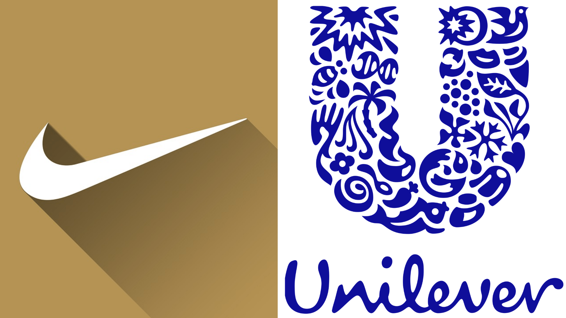
Borrowing from Airey’s statement, since your logo is the face of your company, it gets the most exposure. An aesthetic, well-groomed logo is what makes your brand look good. But if your good-looking logo still fails to express your brand’ values – the qualities and mission statement that make you stand out from the crowd – you will not be a faceless brand, but worse, a soulless one. Before you take up the mantle to create a brand logo that is coherent and distinct, you need to first understand your brand properly. Once you know what makes your brand unique, you can weave that into your logo in creative ways. By aligning your brand logo with your brand identity, you can shape a design that truly complements your brand. For instance, see Nike’s simply iconic ‘swoosh” that symbolizes the sound of speed, movement, power, and motivation. Or Unilever’s deceptively simple U that is filled with a variety of seemingly random images. Did you know that each of one of those images represents the range of product Unilever makes?
#2 Finding inspiration
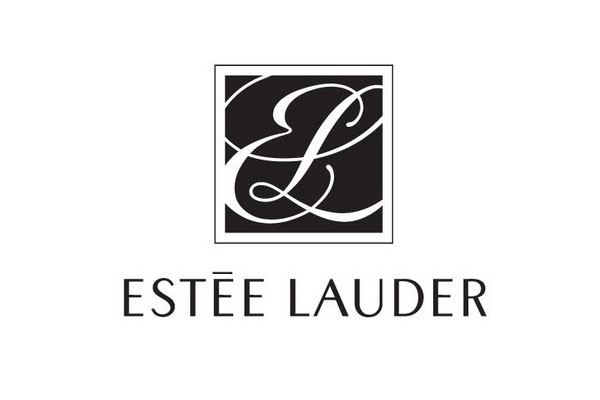
All great ideas derive inspiration from somewhere. Your logo could be inspired from ancient mythology to modern history, age-old concepts to made-up ones, complex ideas to a simple thought. To get your creative juices flowing, you can take inspiration from just about anywhere. And a good start is to scope out your competition – it reveals what you need to do differently. In fact, it’s amazing to see how different logos of brands from the same niche can be. For instance, Estee Lauder’s letter-mixed black-n-white wordmark logo exudes class and elegance, whereas Benefit’s silly yet sophisticated design in bright pop colors gives off a bold and youthful vibe.

#3 Picking the design
Logo designs are not something you create on a whim. As much as it requires an artistic touch to make it look attractive, logo creation can flow more fluidly as a result of some careful planning and plotting. A logo symbolizes the brand through design, typography, imagery, and colors. But before you dive headfirst into colors and typography, you need to first pin down your logo design type. No need to go on an extensive googling run, for we’ve already compiled the best logo design types for you to pick and choose from:
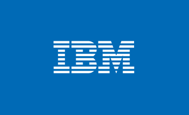
- Lettermark: As the name suggests, lettermark logos consist of letters. Optimizing for simplicity, these typography-based logos are a favorite among brands with big names that once initialized, become easy to remember. For instance, almost everybody can recognize the blue and white logo of IBM or HP, but not everyone can remember their full form.

- Wordmark: Wordmarks are font-based logos for businesses with unique and succinct names. This way, your customers can easily memorize your distinct font and recognize it anywhere. Disney is a classic example of a wordmark logo imaginatively used to convey their brand’s essence.

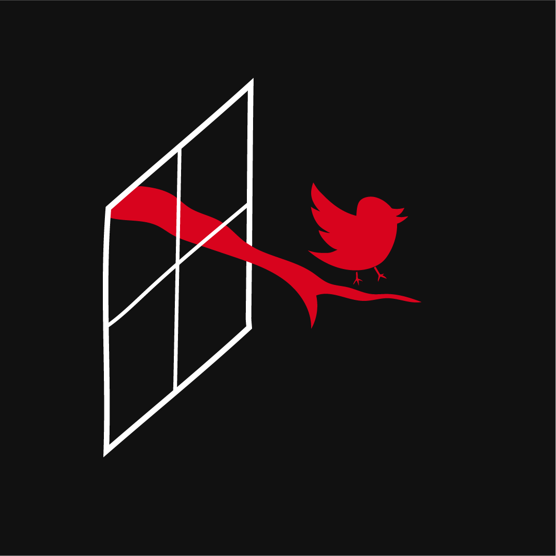
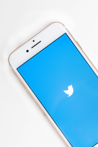
- Pictorial mark: Also known as a brand symbol, pictorial marks consist of an icon or graphic that distinctly identifies a particular brand. As people associate the brand with the image in its logo, pictorial marks should be both unique and coherent. As great instances of pictorial marks, you can easily recognize the brands below with the graphic image of a bluebird and a green robot.

- Abstract logo: An abstract logo is exactly that – abstract. Unlike a pictorial logo with its easily recognizable images, abstract logos are non-obvious geometric designs that are customized to symbolize your brand more through color and form. Interestingly, their abstractness lends to their uniqueness, making them easily recognizable. Pepsi’s red and blue sphere is the most famous example of an abstract logo that people instantly recognize, but rarely know the concept behind it.

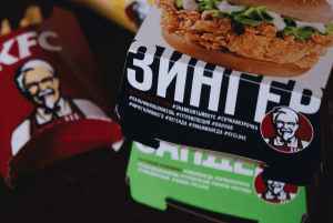
- Mascots: Mascots are not limited to the Olympics and sports teams. Brands too can have mascots that act as their spokesperson. These illustrated cartoonish characters are just as distinct as pictorial marks that give your brand away. Some famous mascot characters are the friendly Chester Cheetah of Cheetos and the endearing Colonel Sanders’ of KFC.

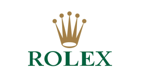
- Combination marks: Combination mark logos are a mix of either wordmark or lettermark with a mascot, pictorial, or abstract mark. As different styles are integrated to form a logo, your customers can easily recognize it with just one element of the logo, either text or image. Doritos or Rolex are perfect examples of a combination logo.

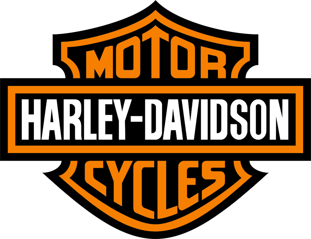
- Emblem: Emblem logos have a traditional vibe to them which adds to their authority and authenticity. Similar to crests, badges, and seals, emblem logos consist of font inside a symbol. Popular among academic institutions, organizations, automobiles, and government agencies, you can easily spot emblem style logos, with the Harley Davidson emblem a well-known classic.
#4 Paying attention to colors.
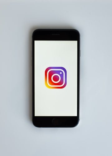
Colors are like condiments that turn a bland meal into an eye-catching, savoury delicacy. With an unending range of colors to pick from, you can select a palette that conveys your brand message in special ways. From the fiery red that symbolizes passion and confidence to the vivacious green that means prosperity and health, every color under the sun symbolizes and evokes its own emotions. When deciding the colors for your logo, it’s best practice to limit yourself to not more than four. While you can experiment freely with complementary or analogous colors, the current color trend favors gradient colors, as you can clearly see in the vibrant Instagram logo. Gradient colors also add more depth to your logo and make it look more professional.
#5 Tuning the Typography
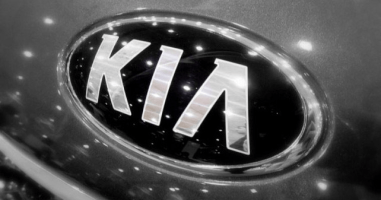
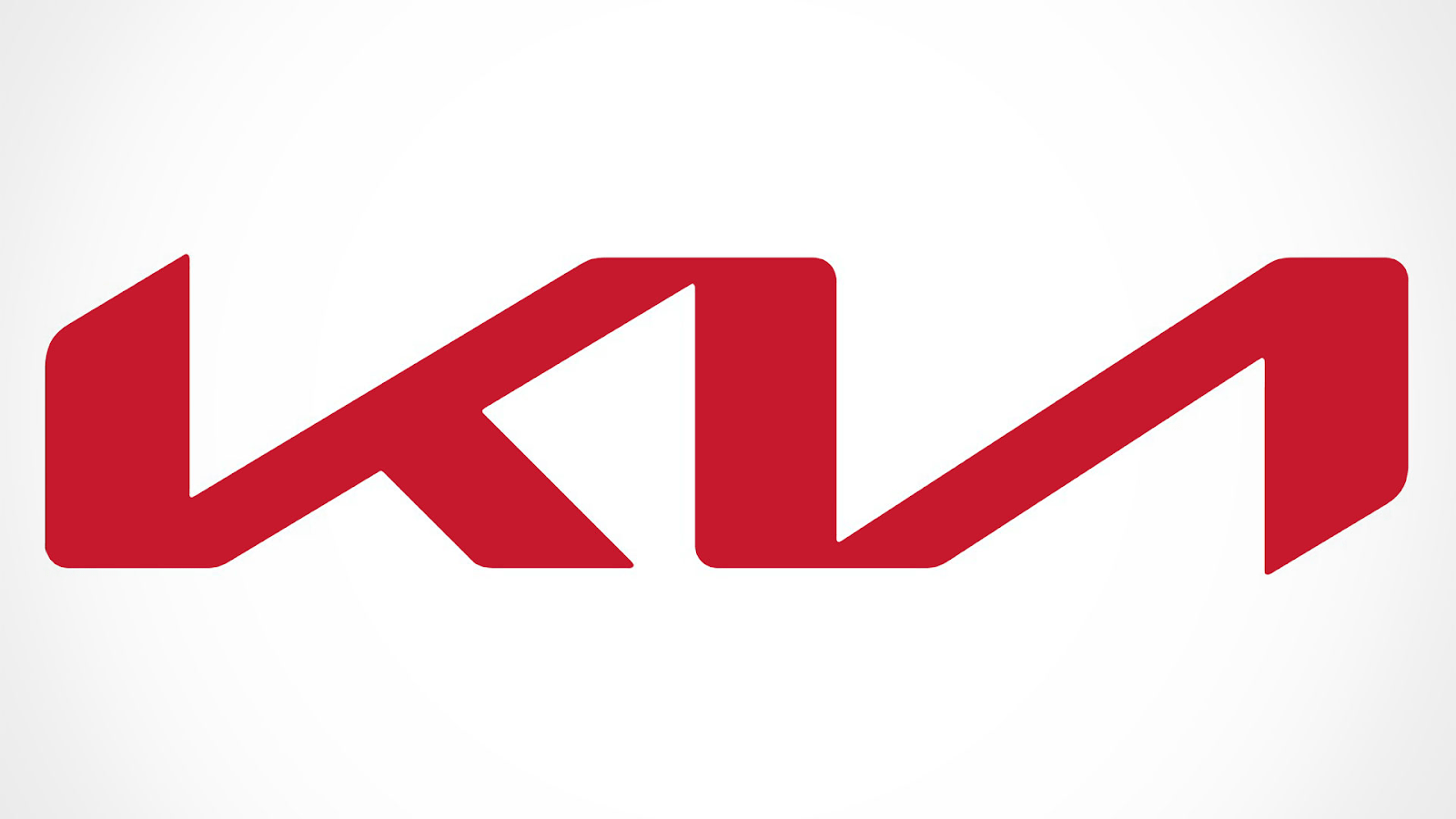
Words matter, and so do fonts. Just like colors, the typography of your logo is serious stuff, even if you are a fun brand. When your logo adopts a certain font, it elicits a specific emotion. Whether it’s the scary Goosebumps logo or the warm Disney font, there’s no mistaking the intent, time, and process that went into creating these typography-heavy logos. Regardless of the font you choose, it should complement the emotion that you want to evoke through your brand. For instance, look at the South Korean car company Kia’s logo – it’s both regarded and dismissed for its simplicity. Like it or hate it, the logo’s plain typographical brand letters inside a monocolored oval have stood the test of time. But car logos have so much more at stake compared to other brands. A car carries it’s brand logo with it everywhere it goes. And seeing the other awesome competitor logos in the market, Kia finally had a change of heart in 2020 and decided to give their old logo a new spin. The result? A fine example of modern logo design that exemplifies how you don’t always need much to capture your user’s imagination. Kia’s new logo, just like the old one, let’s the typography do the talking.
#6 Staying true to the logo checklist
The 5-point logo checklist is like the Ten Commandments for graphic designers. Follow these pointers religiously, and you are bound to create a logo that is distinct, unforgettable, and effective. Doing your research, pinning down your core brand values, exploring the deep recesses of your creativity, and being in tune with modern trends are all great ways to come up with an exquisite logo. But to ensure that your logo is perfect, it must tick all these boxes:
✔️ Simple
✔️ Scalable
✔️ Legible
✔️ Memorable
✔️ Unique
So, now you know. We’re looking forward to feasting our eyes on your awesome brand logo!